Don't Fear The Creeper (Revised Re-Post)

A while back, somebody asked me if I might do some kind of examination of Steve Ditko's evolving art style, so here 'tis yet again.
I picked "The Creeper" as an example for a couple of reasons -
First, it was Steve's last major superhero book of the 60's, and secondly, it was one of the few creations that he returned to after some gap in time, thus allowing an easy comparison. 'Kay?

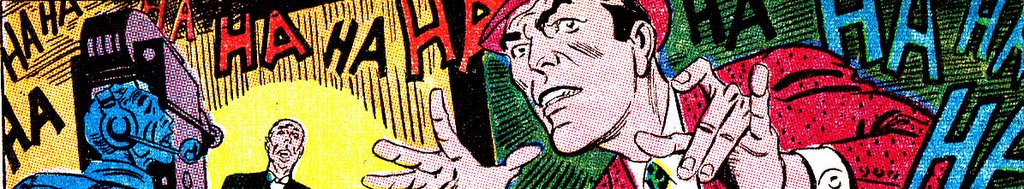
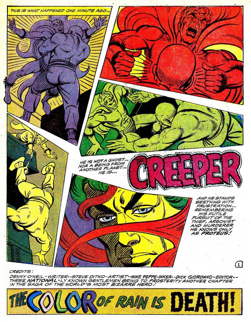
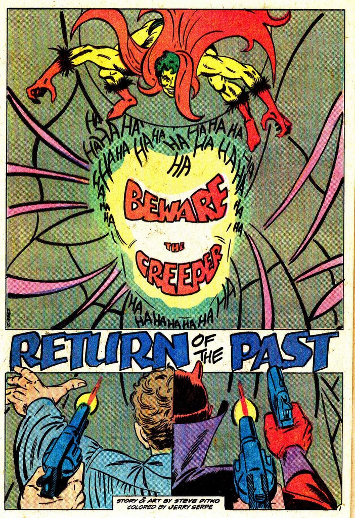
After this KILLER splash panel, we get into the (almost arbitrary) origin story. Bad-guy "Angel" Devlin (cute huh?) leads a robbery...
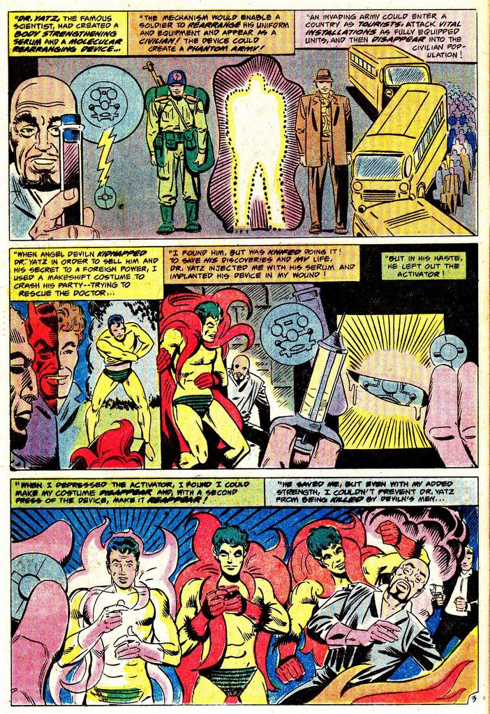
....which kills old and kindly scientist/inventor.....
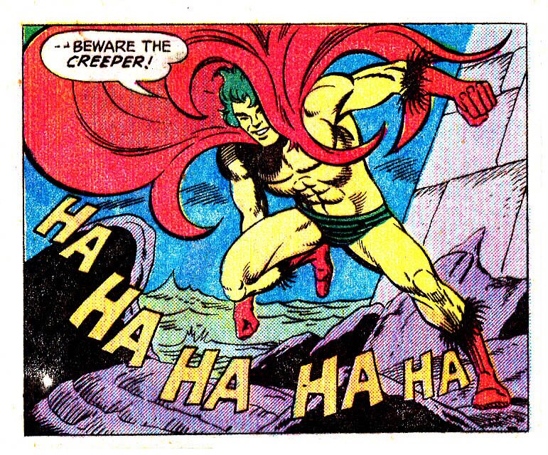
....only to be avenged by his newly super-powered creation.... kinda cliche.... except of course the LOOK of the character and his M.O.!
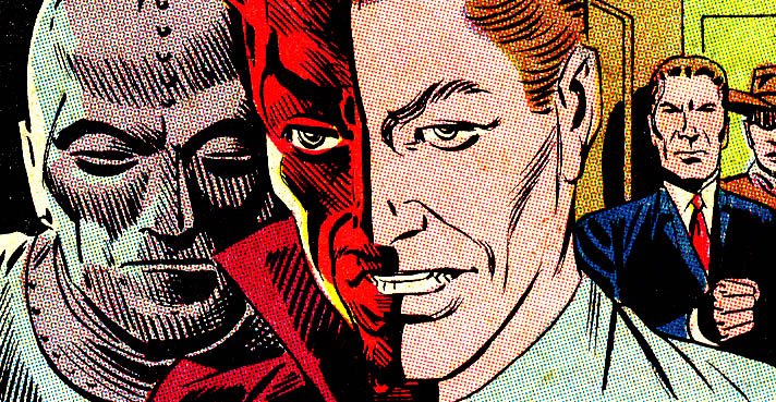
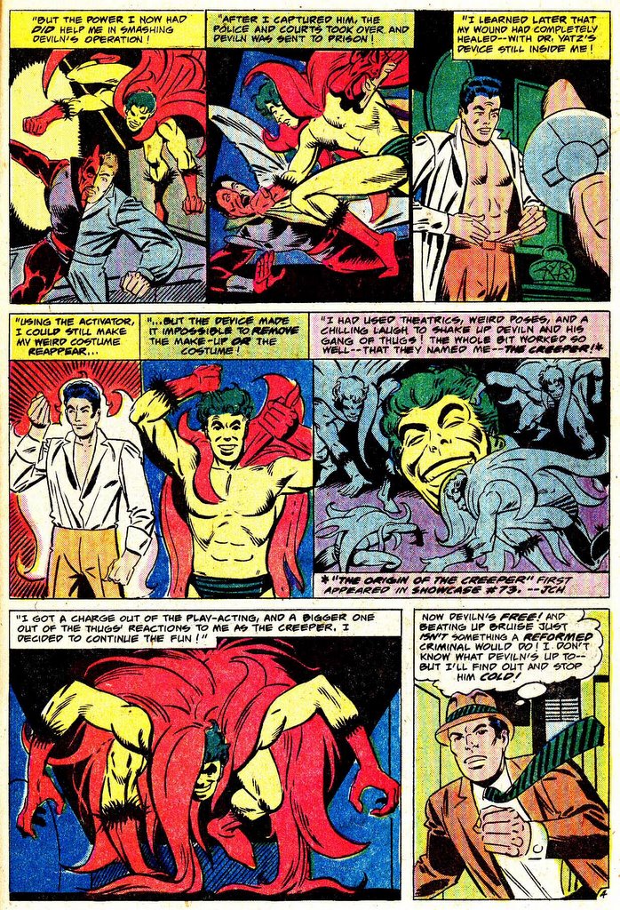
In fact, i think The Creeper gets that all 'round award as the Weirdest "mainstream" character published by DC. i mean just look at this guy! Is he wearing eye-liner? Sometimes i really wonder whether Steve was having some bizarre kind of private joke here, probably at the expense of everyone else....

This page shows Steve still laying out the panels in a very similar style to his recent work on Spidey and Blue Beetle - he's still locked into the 9 panel grid with lots of long and medium shots, some break-up of the grid for story-telling and dramatic purposes, but still pretty traditional stuff.
Showcase 73

After his one appearance in Showcase, The Creeper gets his own book, and in a lot of ways, this book seems to look a lot more like his art on Spiderman. The "Rainy Cityscape At Night" (as opposed to say, the "Eisnerschpritz" is Ditko doing what he does best, still looks a lot like the "mise-on-Spidey" for example....
Some weird things though... colored panel borders? Well, it was the 60's and DC was certainly trying a lot of very weird thing in an attempt to compete with Marvel....
I also always liked the fact that when Jack Ryder was The Creeper it wasn't a costume.... more of a transformation... into a bit of a monster, really.

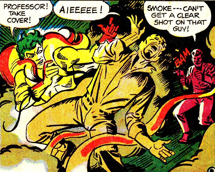
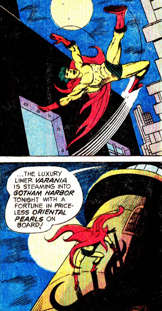
They way Ditko depicts The Creeper in action is also very similar to El Spiderman.... lots of swinging, rooftop hopping and wall-climbing going on. Also the intense negative reaction of officialdom and the public is also a common riff.


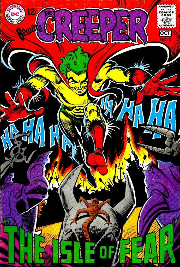
Creeper 1

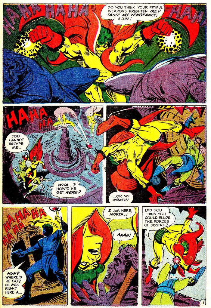
Issue #2 sees the introduction of Proteus, the continuing villain of the series.
In this issue, the panel layouts start to get more experimental, as above.

The 6-panel grid, with less long shots, to appear with more regularity. The Creepers' body language is almost identical in visual appearance to the typical Ditko-esque Spidey/BB "hopping around" style.

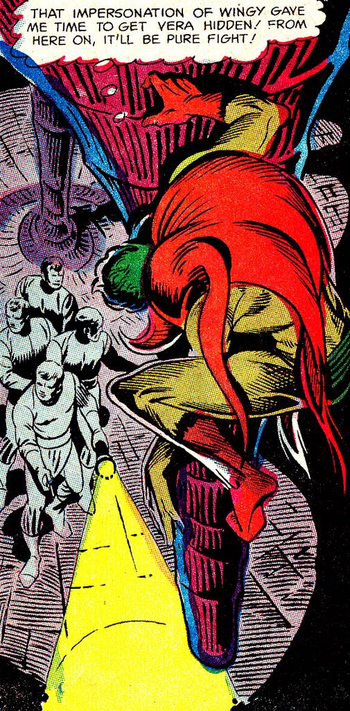
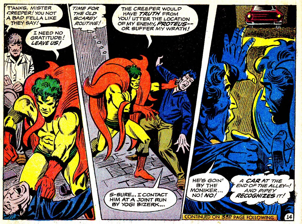
Jack Ryder meets Proteus!
Really nice example above of how Steve leads the eye from panel to panel as he tells the story. This is why Steve Ditko is one of the masters of comic-book art. Simple and effective.
Creeper 2
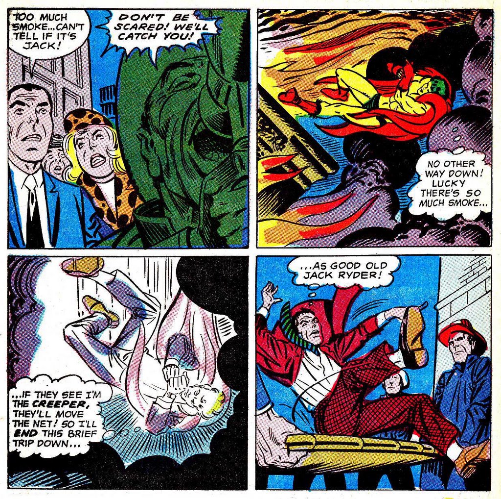
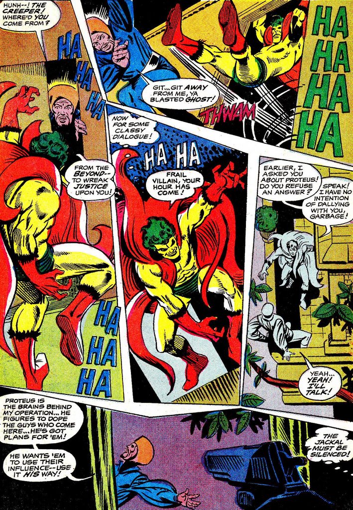
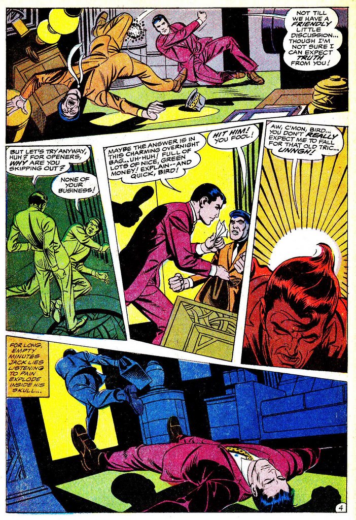
In issue #3, the art starts to get looser and looser and looser. More experimental page layouts like this.

More closer shots and close-ups. Characters are starting to go outside the panel borders.

Still nice stuff, and one of my favorite issues of the run. Love this panel here.
Keep in mind, that while the panel layouts are less traditional, the ease of story-telling is quite straight-foreward for the reader to follow.
Creeper 3

Who knows what's going on here. Not me. After the typical if symbolic cover we head into...

... a pretty traditional looking splash, with some pretty weird camera angles.....

..... things start to.....
...get stranger......
....and stranger. This is pretty hard to follow sequentially. I have no other comment except... Wha?!?
Creeper 4
Even in this cover, you can see Steves' art style quickly move towards what his work would come to look like in the 70's & 80's.
Inker Mike Peppe was brought on board, and the word on the street is that Steverino had some health issues at this time.
Still some nice stuff in here.

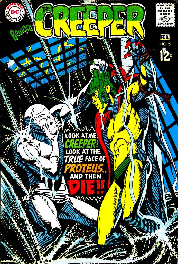
Creeper 5
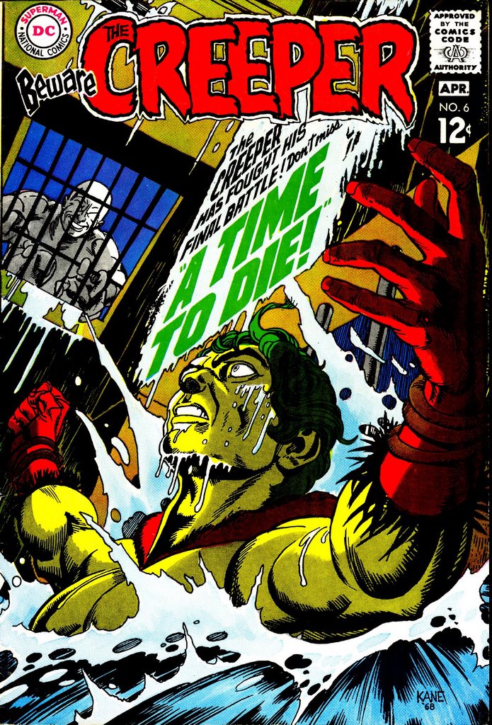
No real Ditko here. Nice Gil Kane cover. The Creeper and Proetus still in the sewer from last ish, literally and metaphorically.

For the sake of completion, really.

And it ends.... not with a bang, but with a whimper.... *sigh*
Creeper 6

After some time at Charlton, Steve-o returns to DC and The Creeper. The "villian" in this issue, however, leaves a lot to be desired.
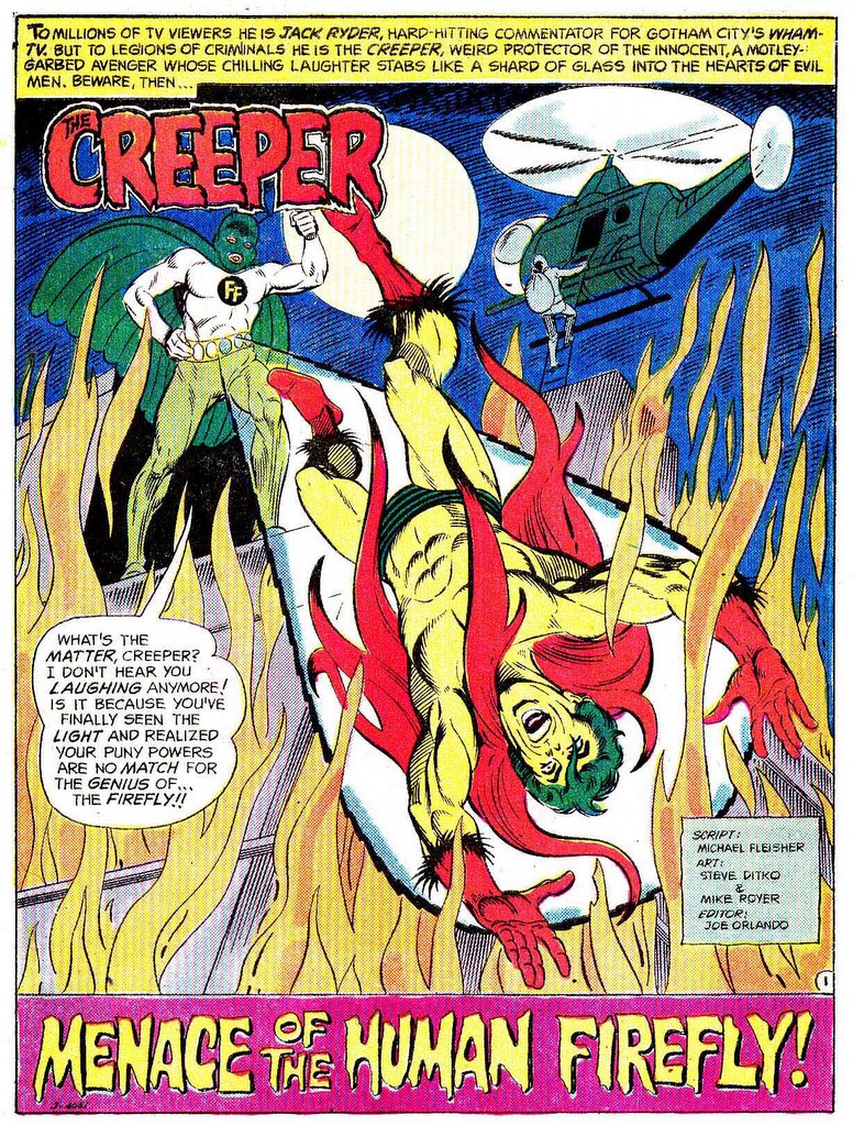
Don't get me wrong.... when it's good....
....it's good...... (nice Mike Royer inks)...
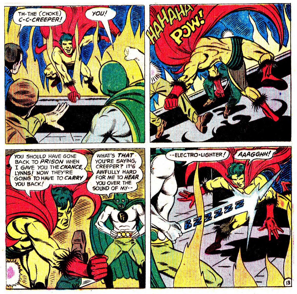
....but "The Human Firefly"? Look at this chump! Wotta get-up! Wotta maroon!
The text page in this ish also recounts his origin and appearances better than I could.

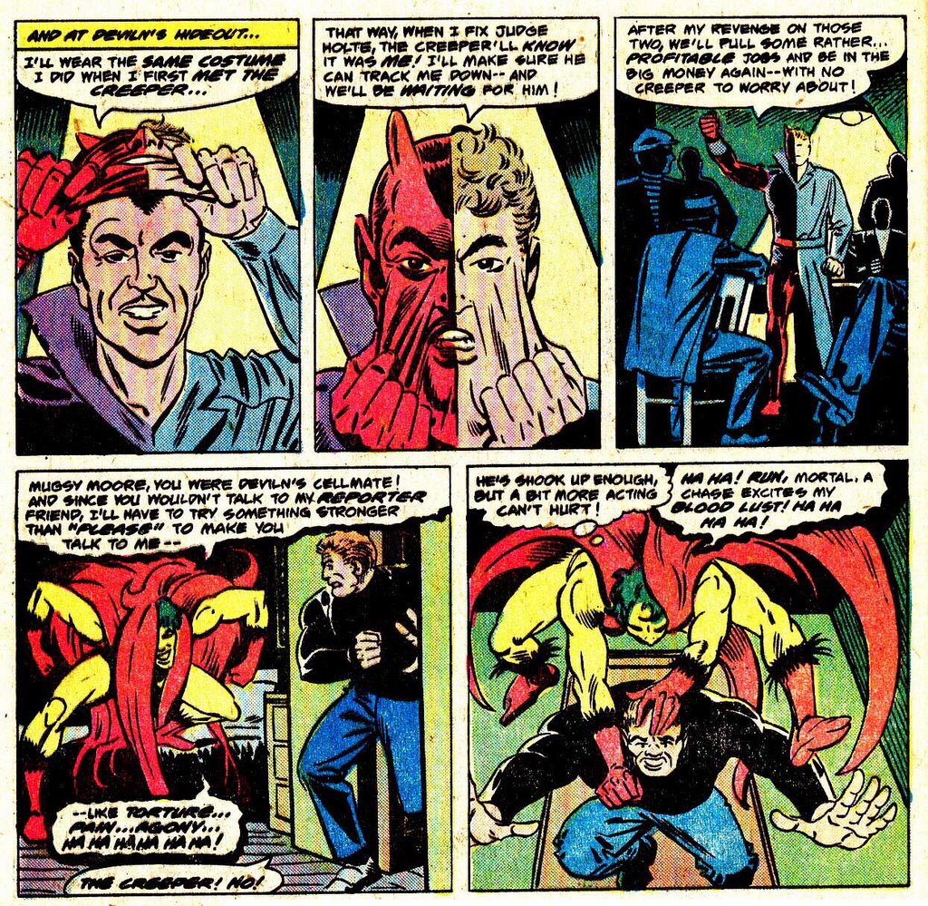
First Issue Special 7


Steve returns one last time doing 8-pagers in "Worlds Finest" in it's Dollar Comic incarnation.

I'm sure you can see the difference in style/layout and such.
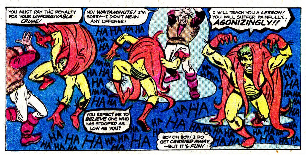

The story in #250 re-caps the origin and features the re-appearance of "Angel" Devlin from Showcase #73.
You can tell Steve put more than usual into this one.

Nice stuff... but very loose in many ways.
Now, what i want to know is....
.... where's The Creeper collection?
It sure would be nice to have all these together....

Quote of the day - "You should have let the past alone!"
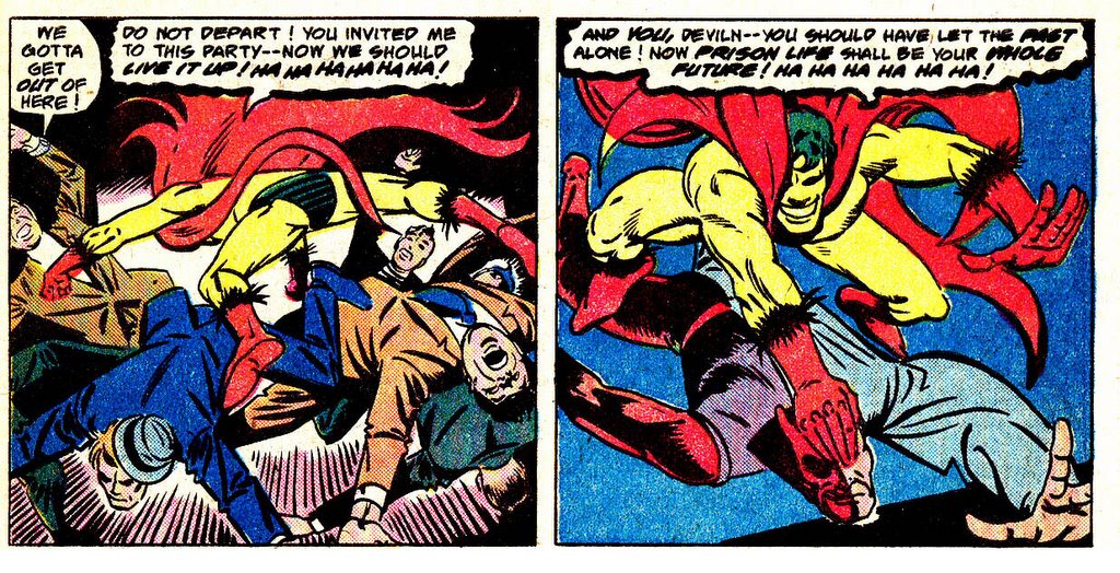
Creeper in World's Finest


By #251, the red thing on The Creeper's back seems to growing larger issue by issue....
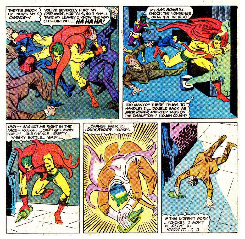
We also see Steve returning to where he started from - 9 panel grid, mostly long and medium shots.

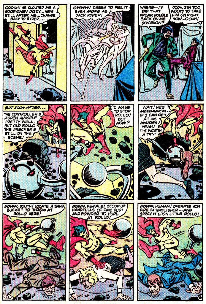
...still bigger.....


Personally, I think this tale from #253 is one of the best of the series....

Maybe a little cluttered, but still great story-telling skills in fine form.


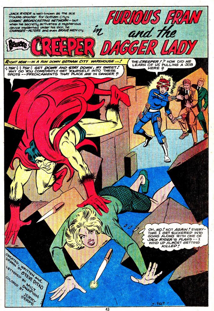
But at the end... I mean to say.... Furious Fran? Sounds like a secretary at Marvel!

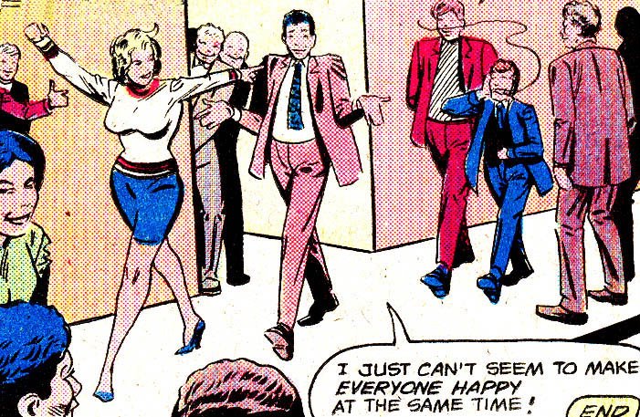
......maybe The Creeper was just too weird to live....

...and maybe Steve (speaking through Jack Ryder) seems to sum it all up.....
Labels: Steve Ditko
posted by hyperdave at 8:00 AM
0 comments
![]()

